A good photograph is one that communicates a fact, touches the heart and leaves the viewer a changed person for having seen it.
It is, in a word, effective.
— Irving Penn
For some, “space” might conjure up thoughts of “the final frontier.” For photographers and other visual artists, it’s more about how the frame or canvas is or is not filled. In this blog, I will share thoughts, ideas and questions to consider in how we fill and arrange elements in the image frame.

My first Milky Way image … celebrating Space!
CLEAR THE CLUTTER
To be clear, we’re not talking about my office. The focus is the “room” of our images. There’s an ancient Chinese art – Feng Shui – that is often used in interior design. It involves the arranging of buildings, objects and space to achieve harmony and balance. Often, you hear of this in reference to working the space within a room with the goal of creating balance and improving energy and flow. It’s way more in depth than this, but the concept can be applied in our image making and can positively influence how we compose and refine the elements within the frame. One of the top points in feng shui is to clear away the clutter. If we do this, we are much further along in creating a stronger image. The phrase, “simplify, simplify, simplify” echoes in my brain. It’s something we all need to consider.
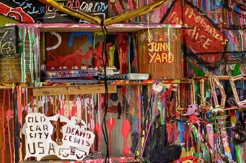
A lot of stuff in this image all about color and creativity.
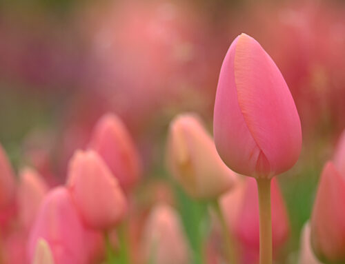
Simplifying the scene with balance and color.
START WITH “THE BOX”
The box is the frame. This box can and does vary in size and shape. From the start (meaning the camera), we have a few basic shapes: Rectangle and Square. These options can be expanded to include a variety, including panorama (long rectangle), a variety of aspect ratios (2×3, 3×4, 4×5, 16×9, etc.) and “free form.” The cameras we generally use give us the 2×3 rectangular aspect ratio (unless we select another option). So, that’s the box we look to fill.
I started with the rectangle, but have since found value in the square and the 16×9 rectangle. And, while these crop options are available in post, I’m fortunate to be able to select each one with my Nikon Z6ii. I do so on a regular basis to challenge myself to see differently through the viewfinder. This also helps me to visualize images in different ways, even when I’m using the standard 2×3 view in camera. The square affords the opportunity to leave out elements that don’t add to the image (as does a vertical orientation). The 16×9 format allows me to remove (leave out) dead areas in the frame, such as a blank sky in a landscape or visual distractions that I would crop out in post anyway.
The shapes we choose to use in the shooting phase, while we are on location, help us create compositions for the space we have to fill. If you have an awareness and option to choose your image area in camera, do it. Your “I’ll crop it later” phrase may be uttered far less frequently. And, that’s a good thing. Getting things “right” in the field always saves you time and regrets in front of the computer screen.
The rectangle works well to include all that matters on this wall.
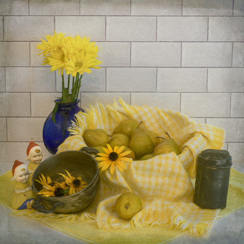
The square contains all that matters in this still life.

This “pano” crop removes what doesn’t matter and clarifies what does.
YOUR SUBJECT AND SUPPORTING ELEMENTS
The first question you need to answer is, “What’s My Subject?” Then, you need to figure out what your approach will be or what your goal is. Do you want a wide view, a more intimate setting, or do you want to fill the frame with your subject? What you want and what you can achieve depends on your subject. Is it stationary (i.e., landscapes, still life, etc.)? Or is it likely to move (birds, wildlife, sports, events)? It also depends on what lens and other gear you have with you. If what you need is in the car, at home or in a hotel, you work with what you have and shift gears.
I tend to photograph more in the stationary realm – landscapes, florals, macro, still life and such. So, when I encounter birds (moving targets), the lens I have with me is generally not long enough. Hence, even when cropping in post, my birds are relegated to the “dot birds” category and are often not worthy of keeping or sharing. If I have my longer lens with me, the results are better. That said, I still have the experience of being there and seeing some incredible things in nature.

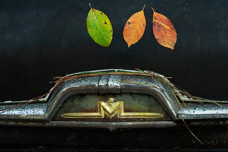
The subject is fall color, with the reflections coming in as strong supporting character. The texture added is a more subtle supporting character that enhances the mood of the image.

The contrast between the white egret and dark remnants the bridge and pano crop highlight the egret as the main subject, even though it is the smallest element in the frame.
PLACEMENT, ORIENTATION AND DIRECTION
The next question for me is, “Where do I put my subject?” The answer depends again, in part, on my goal. It also depends on whether that goal is possible. Remember, your subject is the STAR of the image. Everything else is either a supporting character or a detractor. You want to compose out all or most of the “bad guys” who are not helping your image. Choosing an orientation (vertical or horizontal) can make a big difference in how the image is read, for many that means left to right. Where you place your main subject in the frame and the space you provide around it has impact.
Some of you may know this already (I did, too), but I didn’t know there was a name for it. The “rule of space” in photography refers to the placement of the subject and the space around it. It states that one should add visual space in front of the subject or in the direction the object is moving, pointing or looking. It adds the illusion of movement, leads the viewer’s eye and creates a sense of scale and depth. It helps you create a composition in balance. This can be applied to animate and inanimate objects. For example, your subject is looking in one direction. Add more visual space in that direction in front of your subject and have less space behind it. You photograph a bird in flight (or not). If your bird is too close to the edge of the frame, it has nowhere to go, no room to move. The image doesn’t feel right because we don’t want our subject to crash. You want to keep this in mind when composing and deciding where in the frame your subject needs to be. Pretend that just outside the frame is a brick wall. Leaving more visual space ahead of your subject lessens the crash factor and overall feels better. (Now, you still need to get the focus and exposure on target, but that’s another story.)
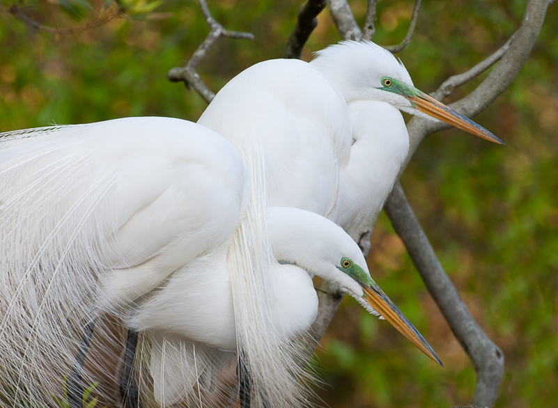
This pair of egrets are still and looking to the right. There’s just enough space ahead of them for a portrait. It’s possible that a square crop could work as well.

Still life following the “rule” of space, creating energy and movement in the space ahead of the berries.
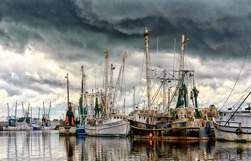
Drama in the harbor. Miss Peaches and Alice Marie are the stars even though two among many.
NEGATIVE AND POSITIVE SPACE
We often hear of how photographers and artists use negative space and not so much on the positive space. Both are important and play a role in how we read an image. Simply put, positive space is typically the subject, and negative space is the “surround” that helps define and emphasize the main subject. Negative space provides breathing room. It can help declutter an image and enhance a sense of isolation, scale and contrast. Negative space can invoke emotions such as calm, peaceful, strength, solemnity and loneliness, to name a few. The use of positive and negative space can be an effective tool in creating images with impact by making use of the space inside the box, and how we arrange the elements.
I often ask myself what feeling do I want to evoke or express. Want to create tension? If so, just cram everything in the frame, as much stuff as possible, and don’t give your subject(s) any room to breath or move. If you’ve ever tried to take a shower in a camper, you can imagine how challenging it can be to move in that space to get everything clean. (I remember that cramped space very well.) Want to create a sense of calm? Give your subjects whatever space is needed in the frame to invoke that mood you want. Want to create a sense of balance, mystery, drama, optimism or excitement? Arrange your subjects within the frame to make that happen. Choose apertures that tell the story and evoke the mood you want to capture. Maybe this means underexposing against the light you’re in or going with wider apertures to blur the background and highlight your subject.
Use the space you have to get the job done. Shoot enough and experiment with compositions and settings to give yourself options when you sit down to select favorite images. I know from experience that we don’t always “nail it.” We miss the mark, leaving too much or too little space around the subject. You may be able to crop in, but there’s no such thing as reverse-cropping. No one shoots everything perfectly. However, if we think ahead and shoot enough more thoughtfully, we often hit it just right or come close enough to achieve the result we want. The “extra” frames are part of the process, part of going with the flow. The “extra” frames allow you to make changes in how you’re using the space and filling the box. “Extra” frames in the field allow you the opportunity to re-frame and refine.
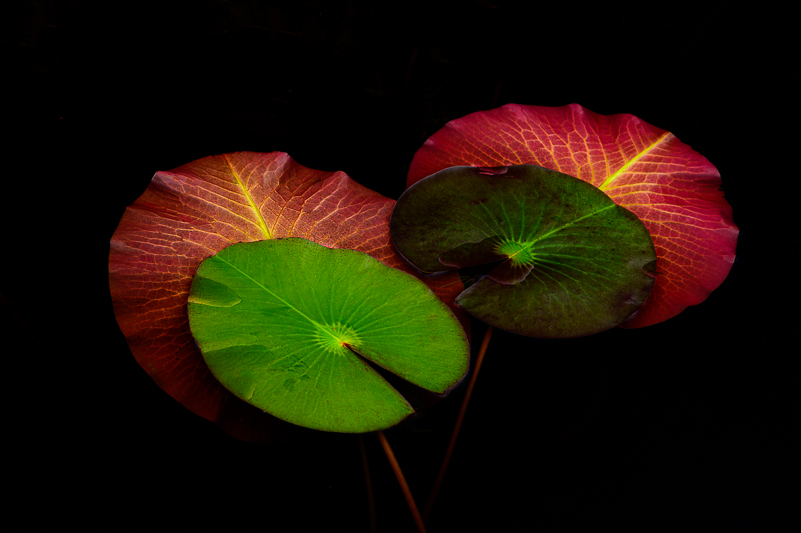
A balance of color, contrast and space in these lily pads.
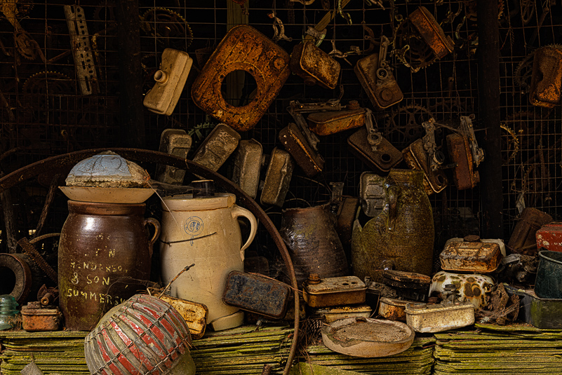
A folk artist’s work bench filled with ideas and limited free/negative space.

Balance of negative and positive space, even as both areas have texture.
QUESTIONS TO KEEP ASKING
If you’ve been with me in the field, you know that I am big on asking questions of myself (and others) to help me get to the heart of an image. So, here are a few to consider.
What made me stop? (Name it!) Why did I stop … here? What’s my subject? Is this the best perspective or place to stand? What do I want to say or share in this image? Do I need a different lens? How much (or little) depth of field do I need? Are there any distractions to remove? (Compose them out, if you can.) Does this scene work better as a horizontal or a vertical? Would another aspect ratio tell the story better?
If you cannot articulate what made you stop, where you stopped, you have little guidance or direction on how to design your image. If you shoot in hopes of having something “good” (or good enough) in the frame, best of luck. If you only stand in one place to photograph the scene or subject, I promise you, you’re missing out. Often, a lean to the left or right or getting lower can make all the difference. If you simply use one convenient setting or focal length, you are limiting your potential for creating a kick-butt image. If you simply “just shoot” and ask questions later, you’ll discover that you were really practicing “crap shooting.” You may or may not get lucky. If you don’t look for distractions in the field, you’ll have to deal with them later. Sometimes, it’s just not possible to “save” an image from the press of the “delete” button.
If you answer even the first few questions, AND you slow down to consider the elements before you click the shutter, the images you make and the way you fill the space will be stronger. The subject and your goal will be clear to you and the viewers, and your intentions will match the visual expression within the frame.
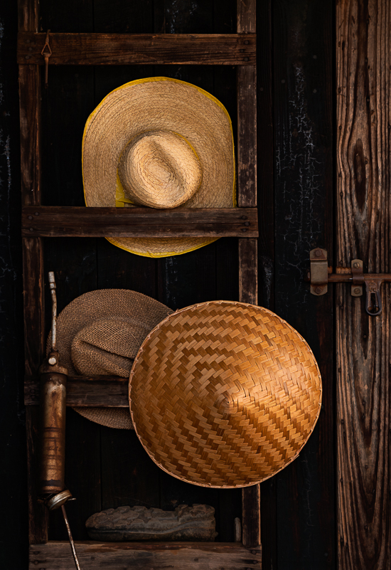
Those amazing straw hats made me stop. The texture and tones held my attention. Everything in the frame spoke to a life of hard work.
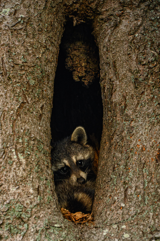
Could not resist this racoon in a tree. Even lighting that allowed catch lights in its eyes and that sweet gesture held my attention and made me stay.
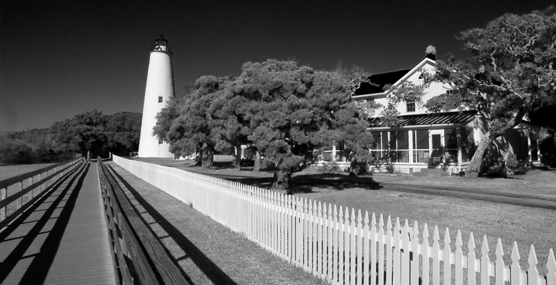
Ocracoke Lighthouse has limited perspectives. Seeing the leading lines, choosing black & white and a pano crop in post provided opportunity for an image that tells a different story.
LAST CHANCE FOR YOUR IMAGE
Let’s assume that you’ve considered and clarified your subjects, answered questions that gave you a direction, and you’ve made intentional choices in how you filled the frame (whatever the shape). Yes, assuming is dangerous, but let’s go there. You still have one more chance to make the “what and why” of your image clear in post. You have an opportunity to further interpret and process your images so they speak to your vision and to allow them to express the emotional impact you envisioned. They have another chance to tell your story. Yes, you have one more chance to ask a few more similar questions before you start.
Why this frame and not any of the other twenty frames I made? What do I need to do to make this one stronger? Do I want the image to document or interpret? And, do I have the tools or skills to make that happen? These extra questions you ask as you review and choose images narrow the path for the final image and give you direction.
When I select images to process, print or share, it’s often because of the subject itself, the light, a gesture or the composition (what’s in the box) that portrays what I saw and how I felt in the field. When shooting, I don’t leave until the “why and what” is showing on the back of my LCD. That could mean that I “got it” in three or four frames or that it took 50-60 frames before everything fell into place.
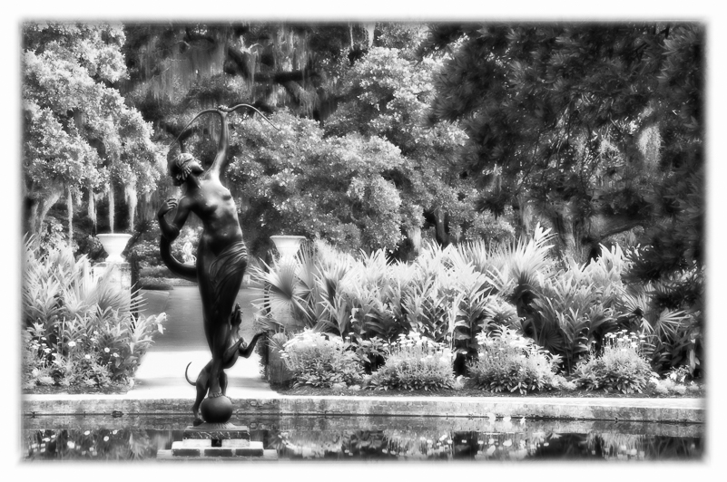
What I noticed was the statue tucked in the curve of the arm of the main statue in the garden. Black and white in post with some added glow felt more intriguing. Off-center framing provided more effective space in front of the statue.
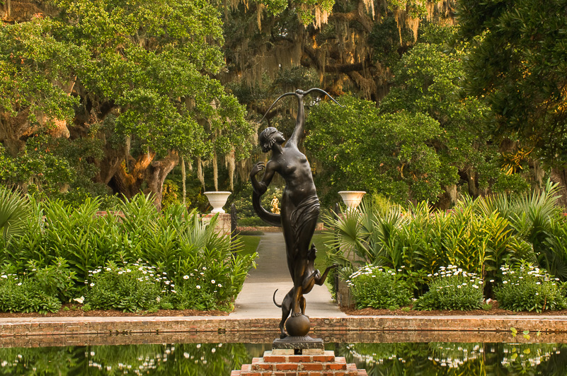
Same subject as above, but composed with main subject and scene centered. This color image tells the story, but the off-center, black & white image is stronger to me. I had these options because I worked the scene long enough to see something different.
GIVE YOUR IMAGES A FIGHTING CHANCE
When you answer the questions you need to ask in the field and fill the frame (the space) intentionally with what you really want, your images have a chance to shine. You need to give your images that fighting chance. Consider your goals. Carefully and thoughtfully execute your plans. Don’t leave until the party starts (and ends). Wait for the smile you get when you know you’ve “got it.” Use the space in the frame with intention. Give yourself a “high five” when it all comes together. Give yourself a hug when it doesn’t. In those times, remember the experience! Enjoy the moments and memories, even if they never make it to the sharing or print stage. We all have those experiences that exist only in our minds. I have lots of them from my early days of photography. Truth is, I had a lot to learn. Still do, and I keep asking questions, too.
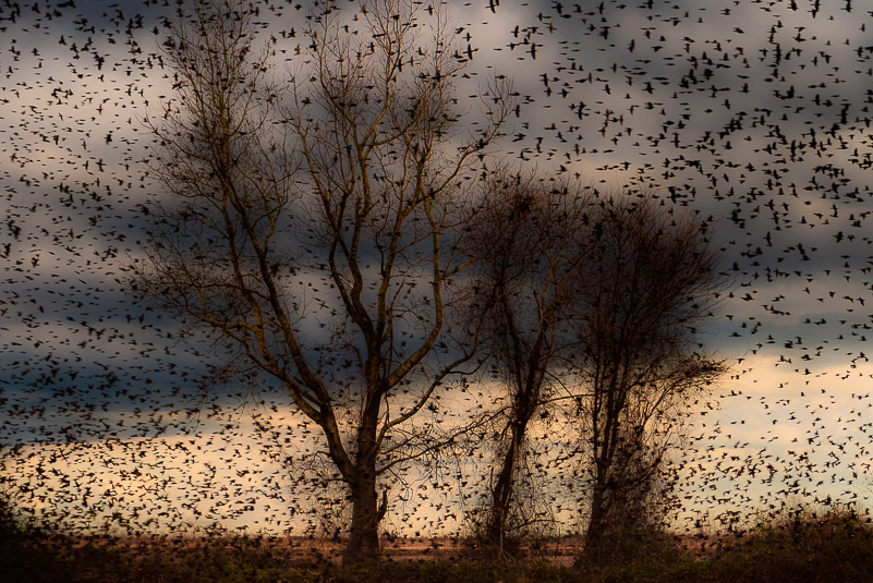
The drama of the clouds and birds surrounding the trees was the starting point. Creative choices in post added the energy I wanted to portray. It “feels” right, to me.
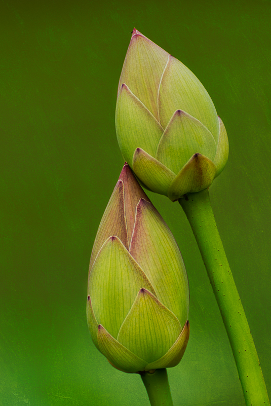
A texture simplifies the background and emphasizes the “relationship” between these two lotus pods.
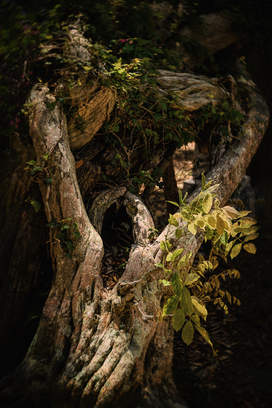
Choices in post transforms the tree roots into a dramatic figure, the one I noticed while shooting in the field.
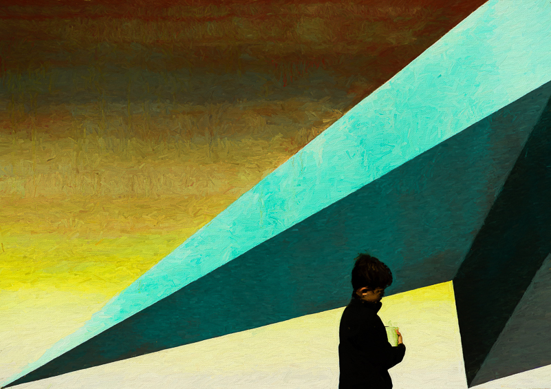
This image started with a wall mural, filling the frame with color and triangles. Serendipity brought the boy, and I waited for him to walk into the frame in what I felt was just the right spot.