I look at the textures, surfaces, colors, and the individual objects in the painting, and then I wonder: What are the relationships among them? Those relationships are everything.
–Mordicai Gerstein, American Visual Artist
THE TOUCH AND FEEL OF TEXTURE
The simplest way to describe texture is how something “feels.” In most cases that would directly connect with our sense of touch as well as our own tactile experiences with a particular surface. I’m remembering a deceptive surface in what appeared to be a soft, fuzzy cactus in our childhood post office and the painful ride home on my tricycle. We are surrounded by textures, and we can use many words to describe them: smooth, soft, fluffy, rough, gritty, bumpy, and so on. We are able to feel or perceive the textures in our minds even when we don’t reach out to confirm the reality. Think of fabrics: the weaves, patterns, threads all work together to create textures with different levels of smoothness or palpable edges. We might buy one set of sheets or a blanket more for its texture than a particular color. And, I wonder how many of us can resist dipping our hands into a bin of polished rocks and playing with the smooth and rounded shapes? Not to mention the sounds that accompany the dip. And, would any of us use a “stress ball” if it wasn’t soft and squishy? How something feels physically influences our response.
By definition, texture is the feel, appearance or consistency of a surface or substance. It involves a surface (texture) and a visual (our eyes) and tactile (touch) experience. How many people do you know who enjoy the flavor of mushrooms but can’t stand to eat them because of “the texture?” I know at least one … In our images, especially those which emphasize texture as a prominent design tool, we are drawing on that visual-tactile experience to translate in our images. This means that the point of the image could be to present texture as a focal point, an element of interest, or the texture could provide contrast in a variety of ways.
The patterns and points are all about texture.
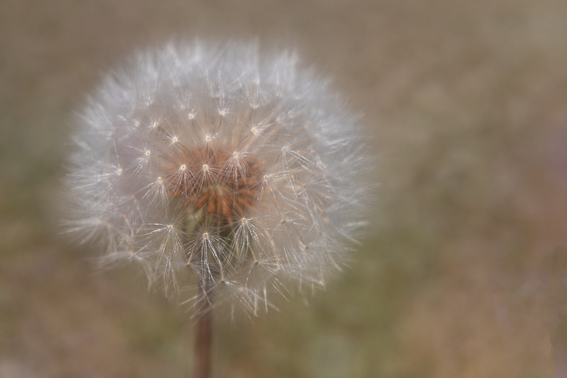
Softness in the dandelion highlighted with Lensbaby Soft Focus II
Texture is just one of the design elements in art (along with line, shape, color, form, tone, etc.). It can be used as the “star” of a piece or a supporting character. Often you will see texture used in paintings or drawings starting with the canvas or paper choice through to the type and volume and handling of the medium. When I think of one of my favorite painters, Vincent Van Gogh, one of the first things I think of is his use of texture in the heavy paint and brush strokes, all of which highlight motion, color and emotion in his paintings. It is the depth and direction of his brush strokes that, for me, create the drama and visual impact. The technique he used is called “impasto,” which involves painting thick, textured paint to canvas with visible brush strokes. It’s a technique you will see in abstracts as well. Consider any of your favorite artists/painters and see how they used their medium and textures and brush strokes for different looks and impressions. Which of those appeal to you more, and why? Is texture something you notice first or do you notice lines or colors more often or quickly? Is the use of texture a “p.s.” in your images or does it often have a leading role? It’s just one of the many design tools we have in our bag.
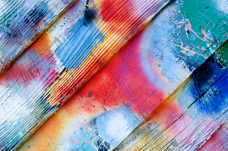
The grain of the painted wood revealed in color abstraction.
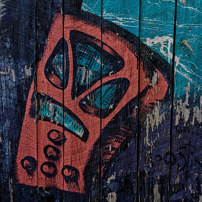
Here the texture is a supporting character in this section of painted barn.
TEXTURE AS THE SUBJECT
So, how can we make use of texture? Choose any subject and spend some time observing it. Consider all that holds your interest in the subject. Then, break it down. Sometimes, what you’re seeing and responding to is all about color or shape or line, and even a combination of these, including texture. Think of the words you use to describe any given subject. Often, there is a dominant element that stands out. Other times, the subject is all about texture. It screams texture. If it does, you have a job to do. Your image should represent those “feelings” in a mighty way – so clearly that any viewer’s first response might be, “wow, I love those textures.” And, since you’re the first maker and viewer of the image, those should be your words as you look at the image on the back of your camera. If you don’t have that kind of response, you have more work to do.
As with any subject or element, it’s not always as simple as lining up a shot, pressing the button and being “done.” Putting thought into where you position yourself and the camera matters. In addition, what lens you need, whether the lighting needs an assist, and, of course, what aperture choice works best for what you want to communicate are factors. Ask yourself what section of the subject is most conducive for your message. As for lighting, typically, a texture is revealed more clearly with side-lighting, but that should not limit your composition choices. Just having an awareness of that will give you an edge when you’re considering your position for shooting.

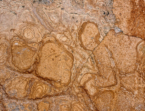
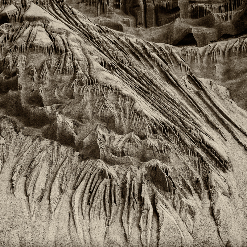
Nature’s amazing patterns created in sand by water.
Backlighting and angle highlights the patterns and textures.
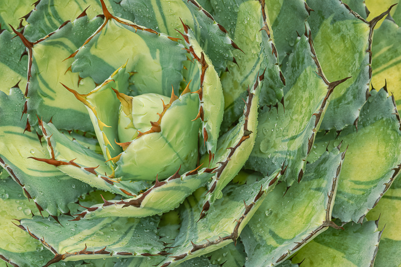
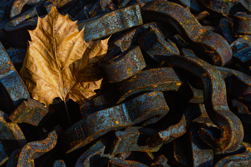
Some subjects that come to mind for textures include: old cars, rust, peeling paint, cracked glass and old wood. And, of course, flowers and plants are full of textures, patterns, shapes, colors and lines. It’s your call on what you want to highlight. What about books and paper, fruits and nuts, baskets and bowls. You see? Texture is everywhere. Depending on your choices, textures can be the main event or it can be one of several elements combined to create visual impact or tell a story.
There’s more to textures than we might think. The more we look, the more we see. The more we see, the more we feel. Textures in our images and in our environment can convey not only the sense of a tactile experience but also contribute to a mood or feeling. Smooth, soft textures can convey gentleness, peace, comfort and calm. Rough hard textures and shapes can create tension and edginess. Changes in colors can also impact our impressions. Compare the feel of satin to velvet to burlap. How about comparing the feel of a peach to a pineapple? A walnut to an almond? Each one has a different texture and elicits different responses.
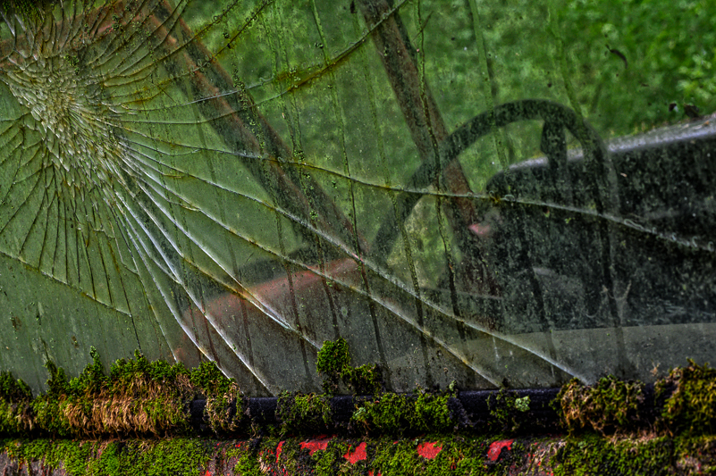
Cracked glass, rust, moss and lichen. Take your pick on textures.
TEXTURES AND EMOTIONAL RESPONSE
When we are photographing, we notice many different things. Sometimes it is an object – a barn, a tractor, a flower or collection of flowers in a garden or a random field. Sometimes what we notice is a single tree – for its bones, its bark or its foliage. We’re attracted to these subjects for different reasons – colors, light, lines, patterns and textures. These design elements work in our minds to grab and hold our attention and prompt us to slow down and consider making an image. It seems to me that each one of the elements or combinations of them elicit emotional responses in us – make us “feel” something. As far as color, I respond more deeply to purple and turquoise far less. With texture, it’s a mix and depends on the subject. I love both smooth and soft and rough and gritty.
What resonates within us and the connection we feel towards a subject leads us in a direction for creating images. The texture of a subject can be the lead dog or simply part of the pack. How we work the subjects and scene determine how an image “feels” to us as the initial viewer and to others. I have found that I am drawn to different subjects, with different textures, in part due to my mood or state of mind at the time I am shooting. Presented with the same subjects or places at different times and in different headspaces, I may not even pay them any attention. In a good and open frame of mind, I tend to notice softer subjects such as flowing water, arching trees, perfect petals and uplifting colors, shapes and soft backgrounds. In a not-so-great mindset, the harder, rougher elements draw me in tighter such as broken things – glass, tools, bruised and broken petals and lots of grit and darker tones, generally.
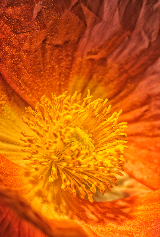
Lighting emphasizes the textures in the poppy center and petals.
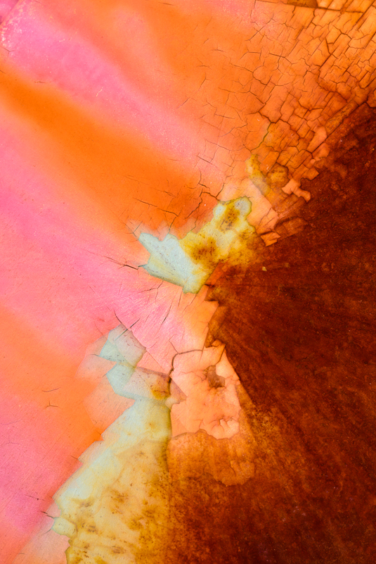
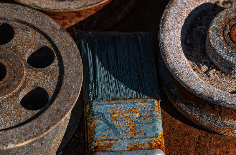
Rust, color and cracked paint provide great combination of textures.
Contrast in color and textures in metal and nature.
The subject choice and how I handle it is not always an indicator of my mood or general state of mind. However, as I look back on certain images, I am often able to remember my temperament of the moment as well as how it influenced what I saw and where I went with it visually. I also know when I’m being intentional in how I render the details for impact – visual and otherwise, and when I’m just going through the motions. You probably can, too. If you pay attention, you will notice how your mood or life moments influence subject choices as well as the treatment you give your images.
Naturally, this applies to other aspects of image design beyond texture. Consider lines as one example: choosing smooth, flowing lines vs. hard, straight or jagged edges and lines. Often times, we simply respond to what is in front of us. Overall, our images become stronger when we go beyond the subject for “what it is” and extend our thoughts to “what it is about.” I find it helpful to say out loud what I’m noticing. Then, I begin the work in that direction first. So, if I say, “I love the ripples or ridges” or “it’s so soft and smooth” or “what cool patterns in that bark,” I’m giving myself a starting point and direction to work the subject beyond what it is. That work can extend to abstracts that focus solely on that texture or highlight it as part of a larger scene. Whatever holds your attention, that’s where you start; and that’s where you stay a while. If it happens to be about texture, make it clear – in the field, and first. Don’t leave your viewer guessing.

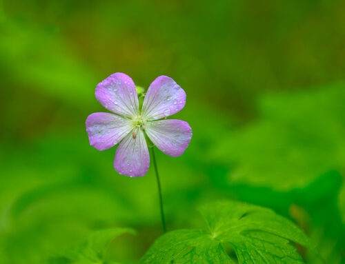
Selective focus provides option to highlight texture of wild geranium petals and leaf.
Dynamic sand patterns filled with texture and design.
Combination of rough grit, rust, paint and shapes.
TEXTURES EXTENDED TO ART
We’ve covered texture in general – the what and how it can be used in our images from the field. Now, let’s move a step further in the direction of art and interpretation. Many photographers, myself included, are drawn to textures in the field but also use them in creating our art and using them to infuse emotion in them. The use of textures that we notice and photograph in the field, or ones that are created in post, can elevate the visual and emotional impact of an image. Not every subject needs to be nor lends itself to being paired with textures of any kind. It is a creative choice. In my view, textures should not be used as a “cover-up” for poor technique in the field. And, yet, there are some images that fall right on the edge of “perfection” in terms of our goal, but some aspect shifted out of place. Let’s say it was wind, soft focus by accident in the wrong place. We just missed, but we love everything else about the image. We see the potential to create a different but similar version by using textures. Those “on the edge” images are fair game but routinely repairing with textures should not be the norm.
I use my own texture images and shoot images in the field with that intention. Motion blurs and defocussed images have great potential for use as textures. I also use textures created by some very creative and talented women: Denise Love of 2 Lil’ Owls, Leslie Nicole of French Kiss Textures, and Hazel Meredith of Meredith Images. All three offer textures and wonderful tutorials, and I highly recommend them for both.
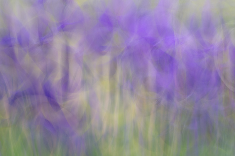
Motion blurs can be wonderful abstracts and also be used as textures, as with these irises.
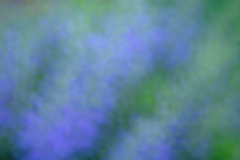
Images with soft textures and color patterns are perfect for textures.
I thought that in this last section I would share a few “before and after” images that make use of textures as a way to express visual and emotional impact and enhance a subject in a way that more closely reflects my goal for the subject. I’ll share some thoughts on why or how I chose to use the textures. My software of choice is Photoshop (and Adobe Camera Raw), Nik Collection and Topaz Studio 2 (Textures & Impression). I make use of blend modes, opacity and masking to achieve the final results. Briefly, in the captions, I’ll share how I got to the end zone with the images.
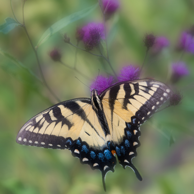
Square crop and basic edits for this swallowtail image are a good start, but some tweaks with breathing room at bottom and texture add impact.
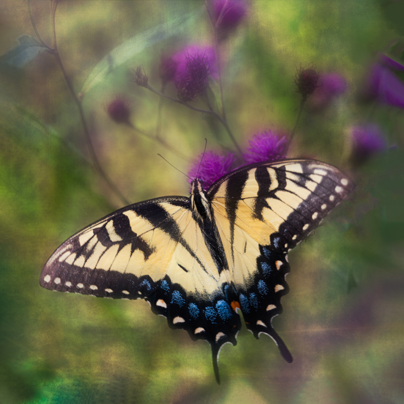
After expanding canvas at bottom of frame, I used a texture in Topaz Studio 2 and masking to add drama that highlighted the swallowtail in the frame.
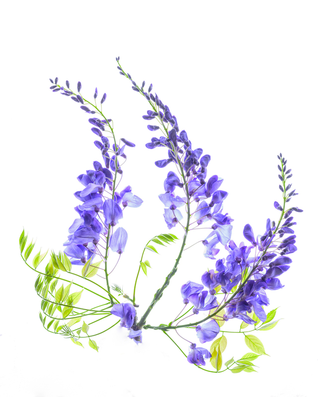
High-key images can be visually impactful on their own.

Drama added with 2 Lil Owls texture and some masking.
PARTING WORDS ON THE VALUE OF TEXTURE
As always, I hope you can see a wider and deeper purpose for paying attention to textures for what they are, what they can be as the star or supporting characters in your images, and how you can use them to elevate or steer how an image feels with the use of textures in a variety of ways. We have opportunities and experiences with how many a surface feels physically and how we can use those textures to impact how our images feel visually. Keep your eyes and mind peeled for those openings, experiment and play, and have fun connecting those sensory dots!
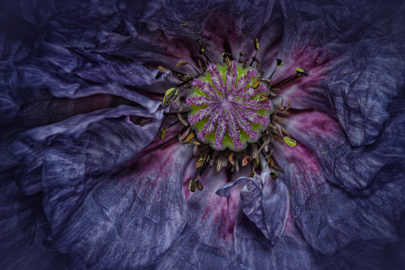
This poppy was filled with texture in its center and petals. Focus-stacking could have captured more detail overall, but I was experimenting more with flash for lighting.
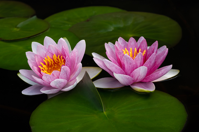
Not all images “need” textures to enhance. These water lilies stand on their own with their shapes, color and smoother textures.
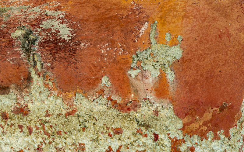
The rust surfers don’t need any help. The peeled paint and patterns offer up the abstract.
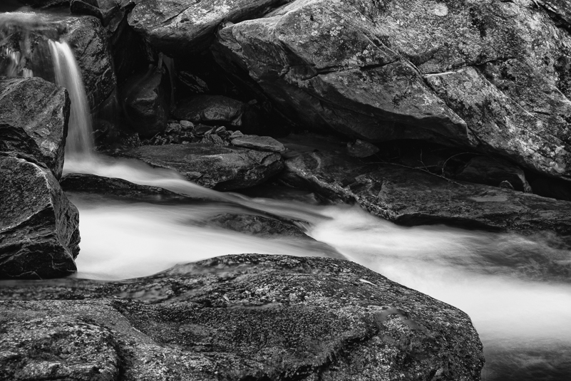
Contrasting textures within a scene of flowing water and rocks.
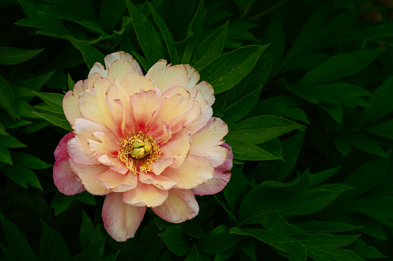
Soft lighting highlights textures in the peony petals and leaves.
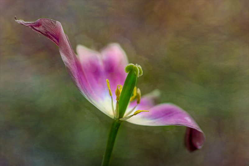
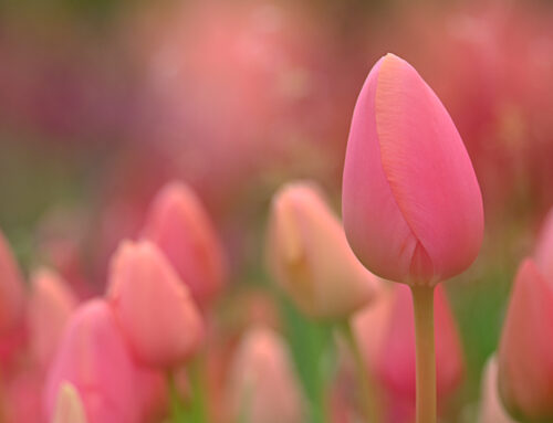
The original background did not “help” highlight the graceful flow of this fading tulip. Adding a texture simplified the scene.
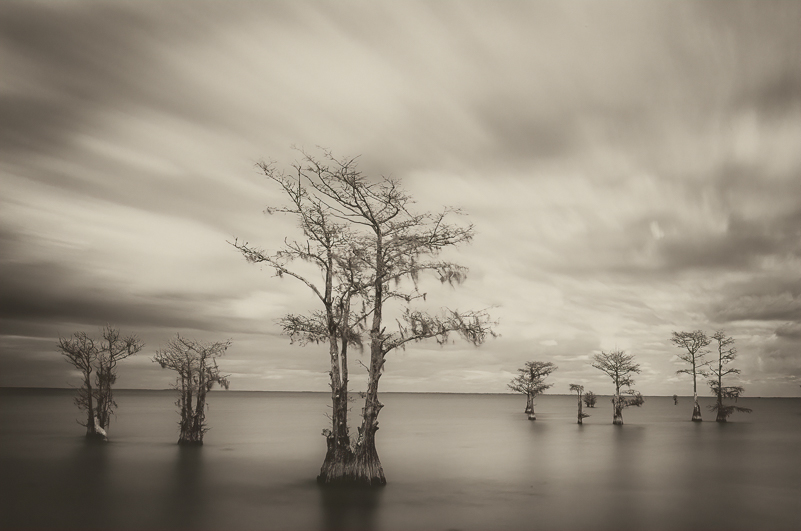
Long exposures smooth water and clouds. If the sky was “empty,” a texture would add interest to the scene.

Waterfalls provide a mix of surfaces and textures to work with.